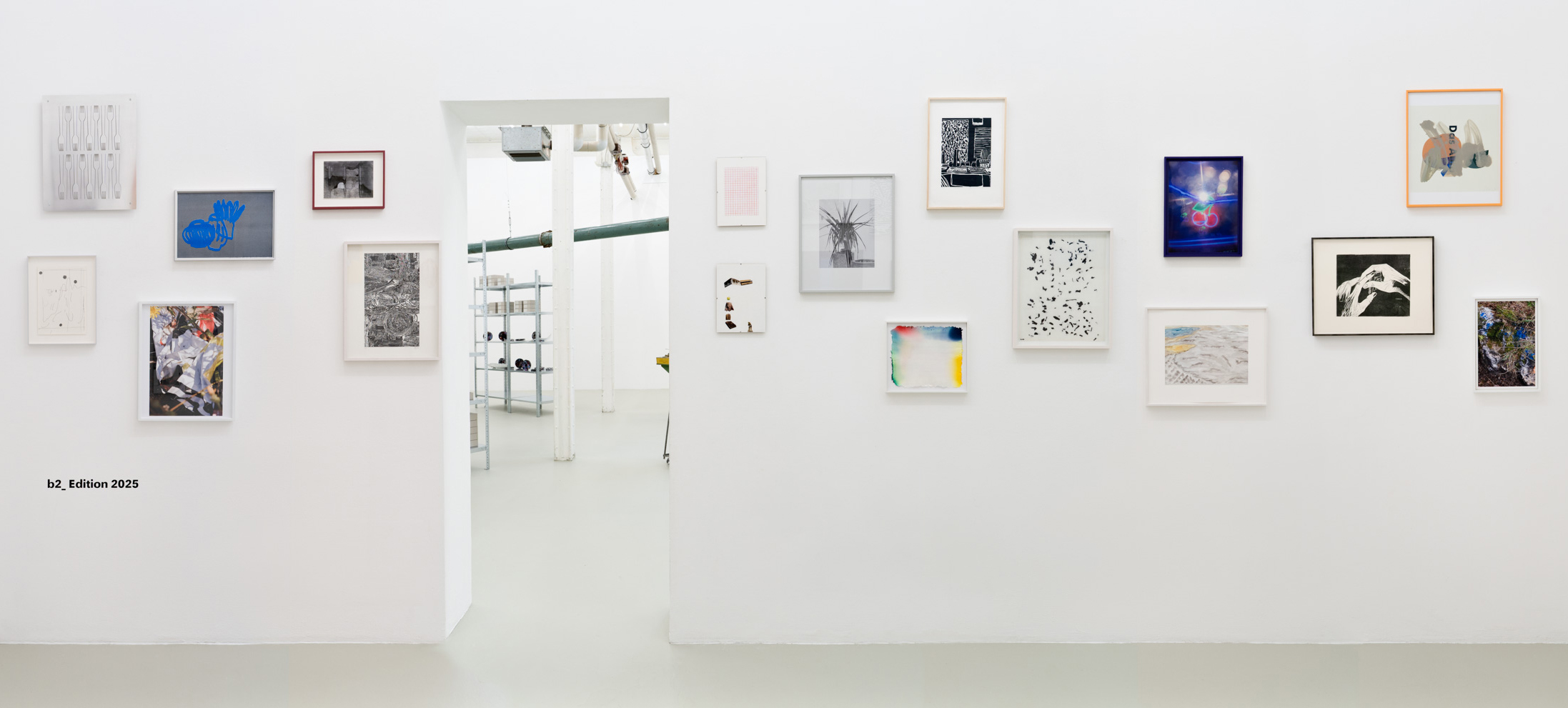
b2_ Edition 2025
for the 20th anniversary of our gallery
This collection features seventeen different artistic positions, all brought together in one edition. The b2_ Edition 2025 showcases new creations crafted especially for this framework. These works were carefully selected.
Each work follows its own language — from graphics to sculpture, from photography to painting. Between surface and space, concept and intuition, a current picture of artistic practice emerges.#
With the acquisition of this edition, you’re not only collecting it, you’re also supporting a place that has combined discursive work and curatorial quality for two decades.
Artists of the b2_Edition 2025:
Christian Bär
Max Brück
Doris Frohnapfel
Michael Hahn
Caroline Hake
Timo Hinze
Katharina Immekus
Anna M. Kempe
Uta Koslik
Romy Julia Kroppe
Florian Merdes
Bea Meyer
Heide Nord
Carolina Pérez Pallares
Karoline Schneider
Selma van Panhuis
Anna Vovan
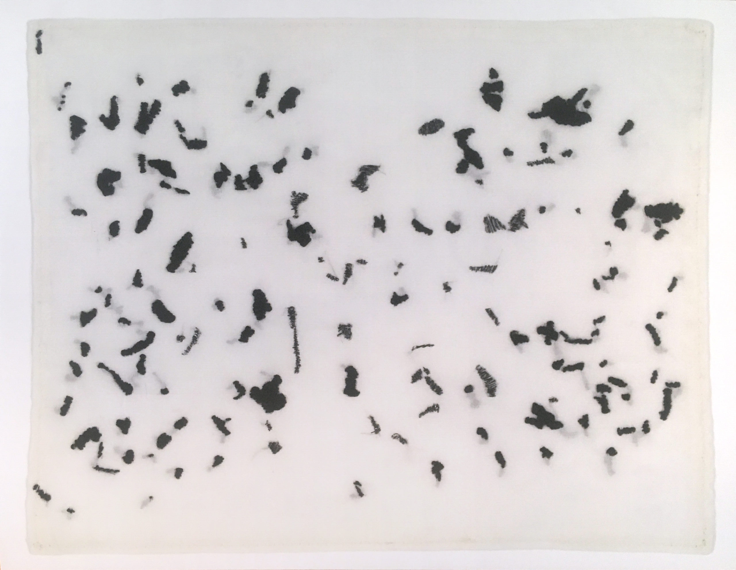
Bea Meyer calls her latest group of works Streuungen (Scatterings) referring to a term from statistics. She has appropriated its methods of representation and development as artistic strategies and procedures in a number of older works: making speculative assumptions, holding discussions, collecting data and finally translating the results into a system of signs. (from @carstentabel, 2024)
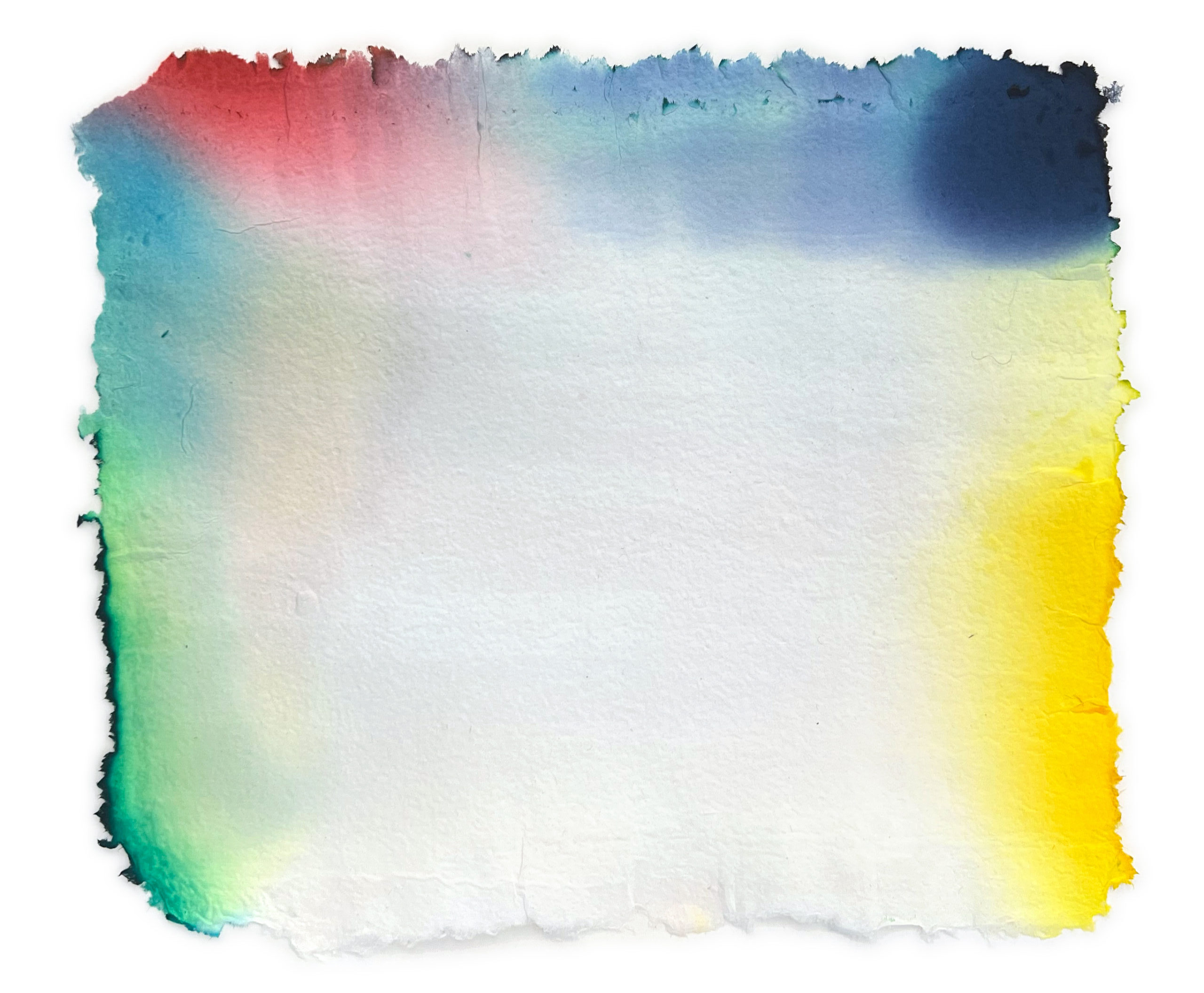
„In the edition All about anyone the colors are mixed in the same process as the paper production. The ink is deposited in different layers so that it remains unclear where the first layer begins. This effect intensifies the moment when
one shade of color meets the next. The colors emerge as part of their own substrate.“
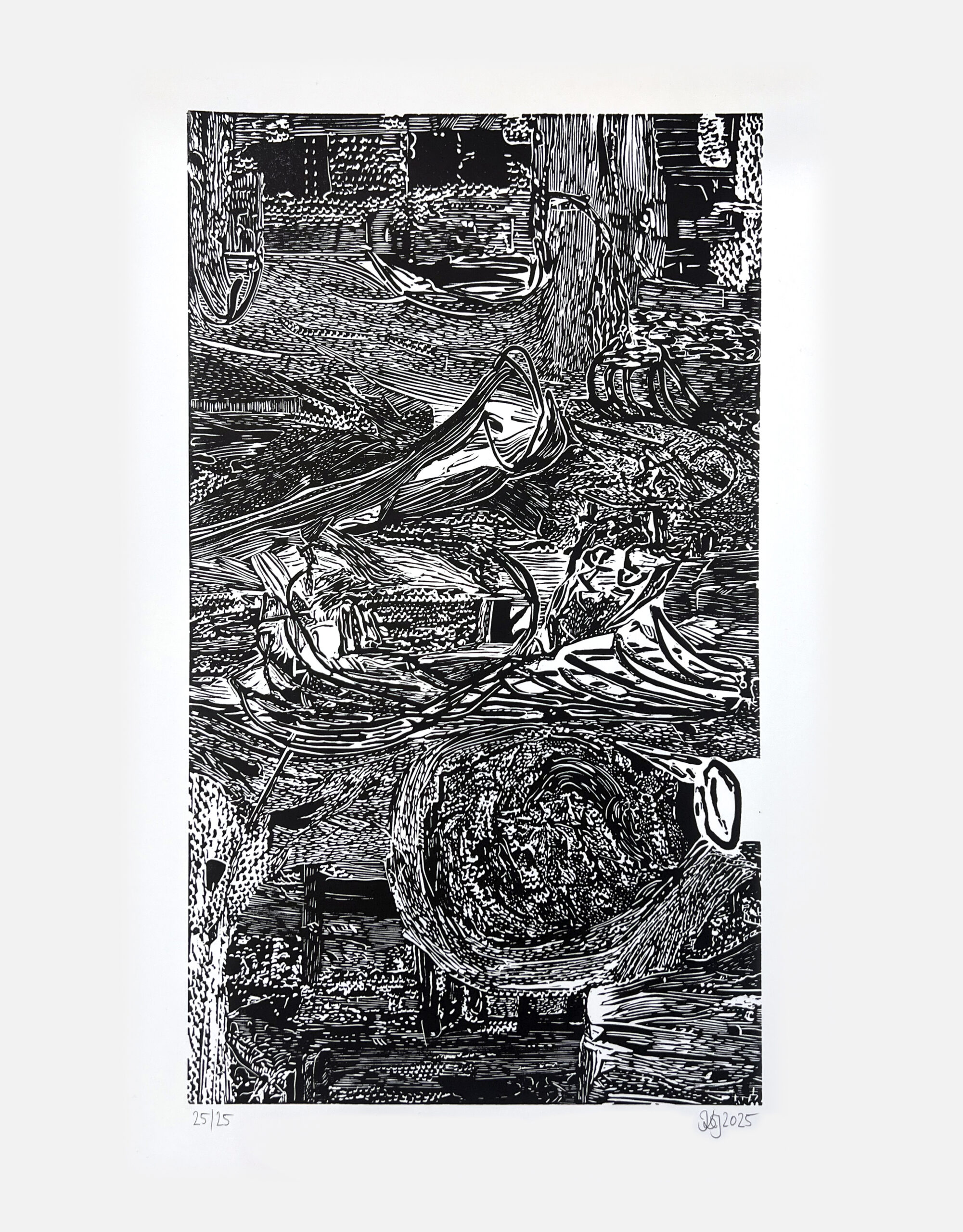
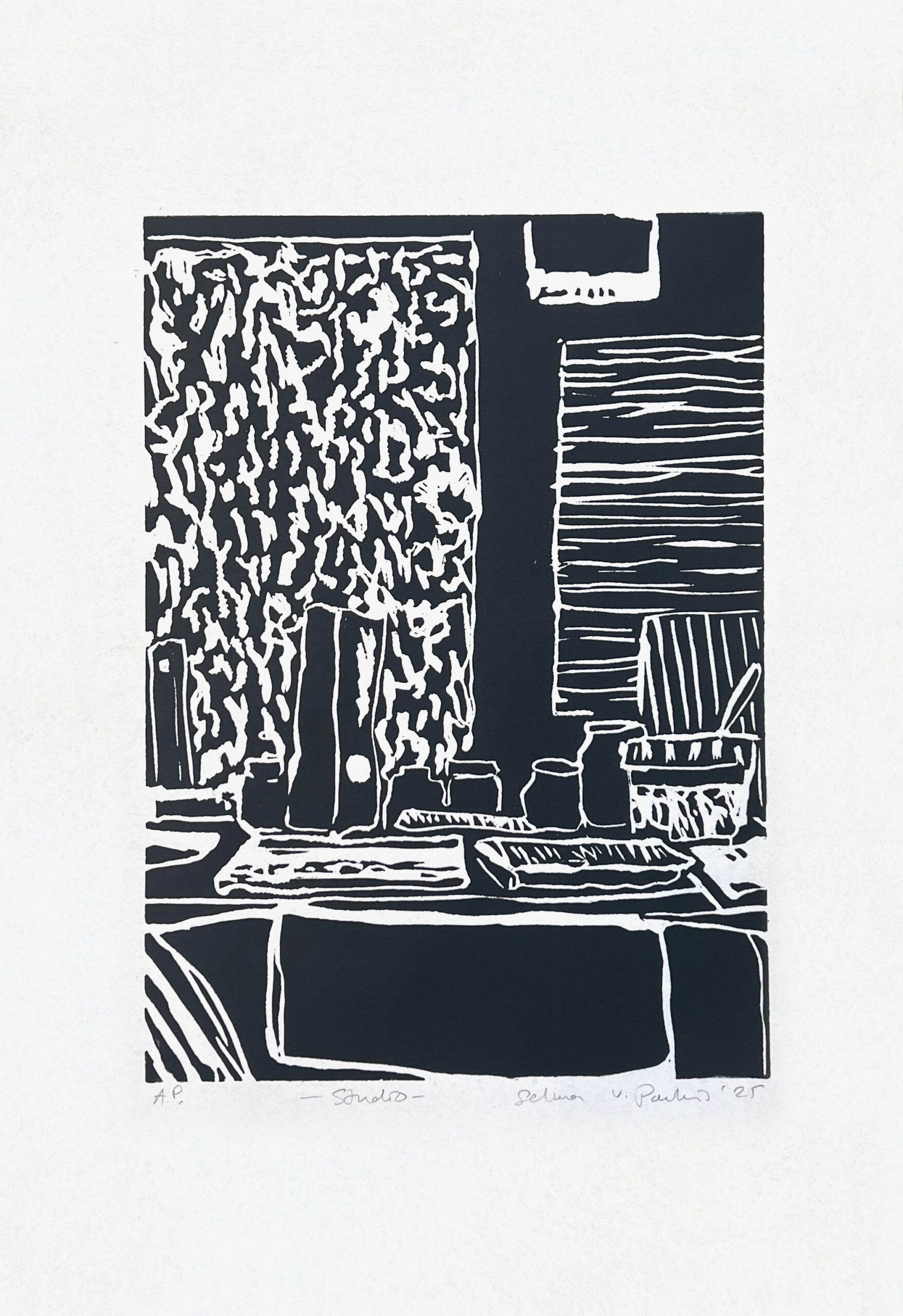
Katharina Immekus‘ current works explore the process of translating painting into linocuts and then back from linocuts into painting. At each step, a new visual world emerges, shaped by the differing techniques and scales. The edition sheet is based on a painting from 2024.
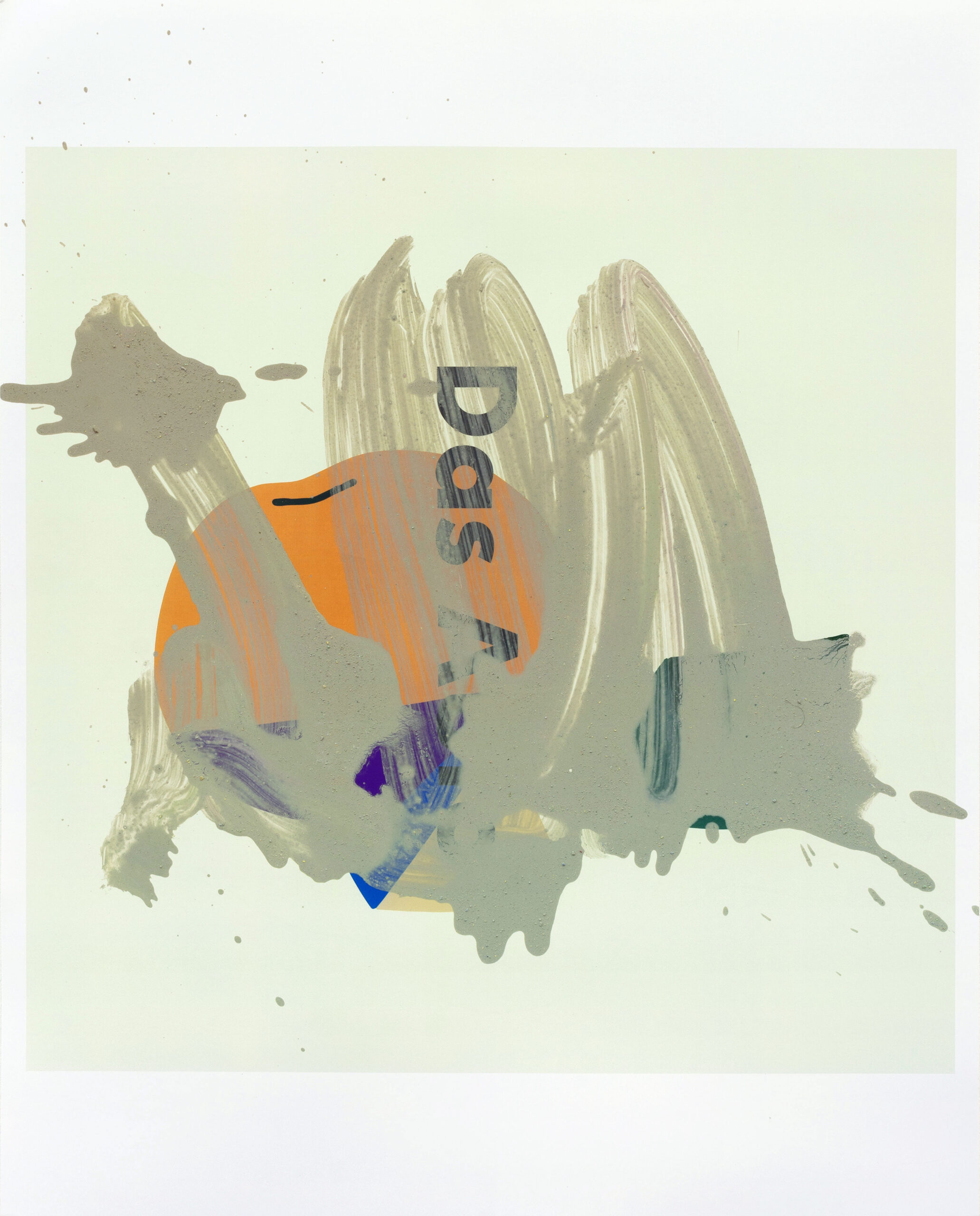
„The car, two hunks of cheese and an orange under gray color mush.“
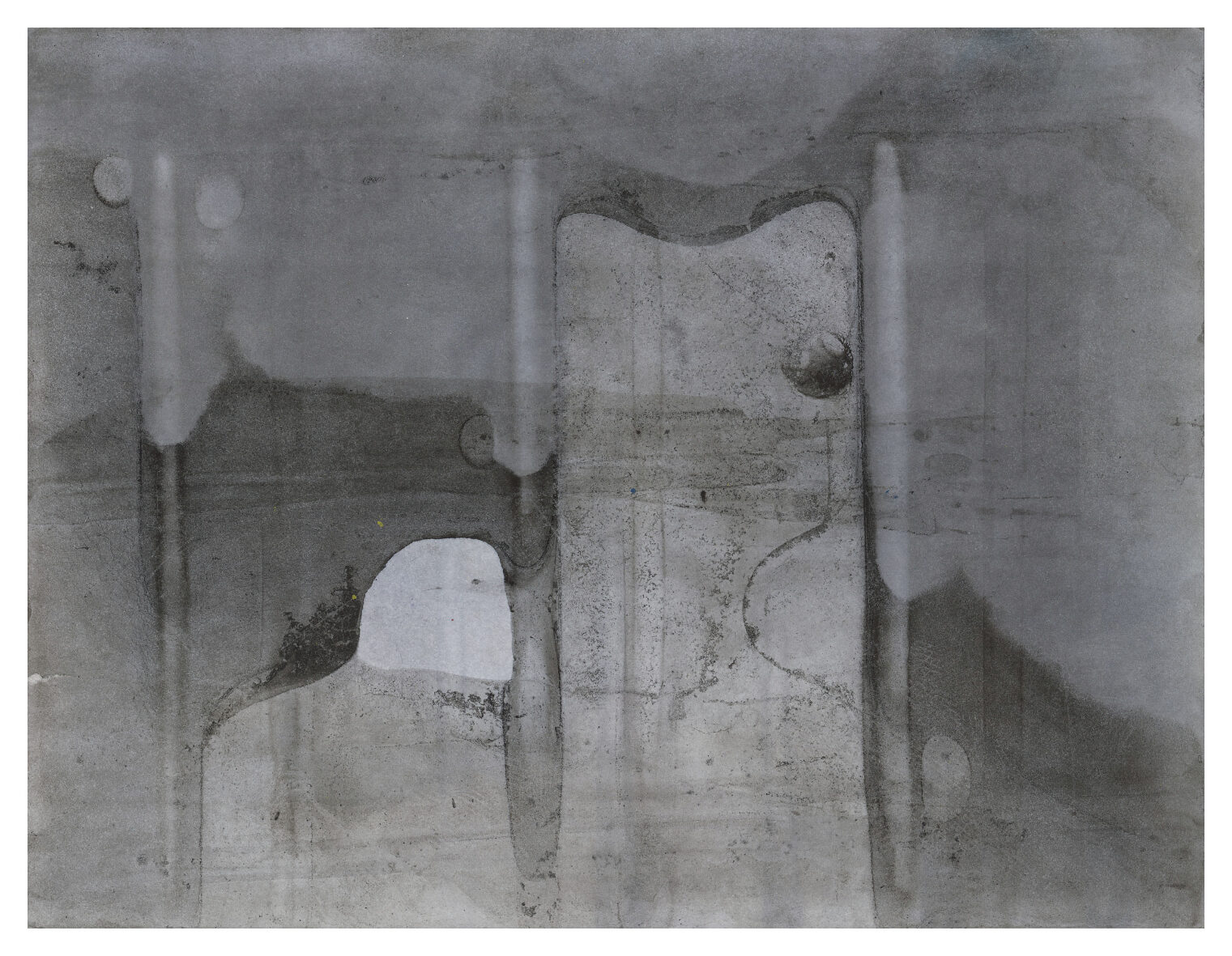
revers (1) shows the reverse side of an analogue baryta paper that has been processed with retouching ink and photochemical liquids. While attention is normally focussed on the front side, the reverse side appears here as an independent image surface. The imprints of the developer tray, the ink flow and the chemical reactions overlap to form a dense image structure.
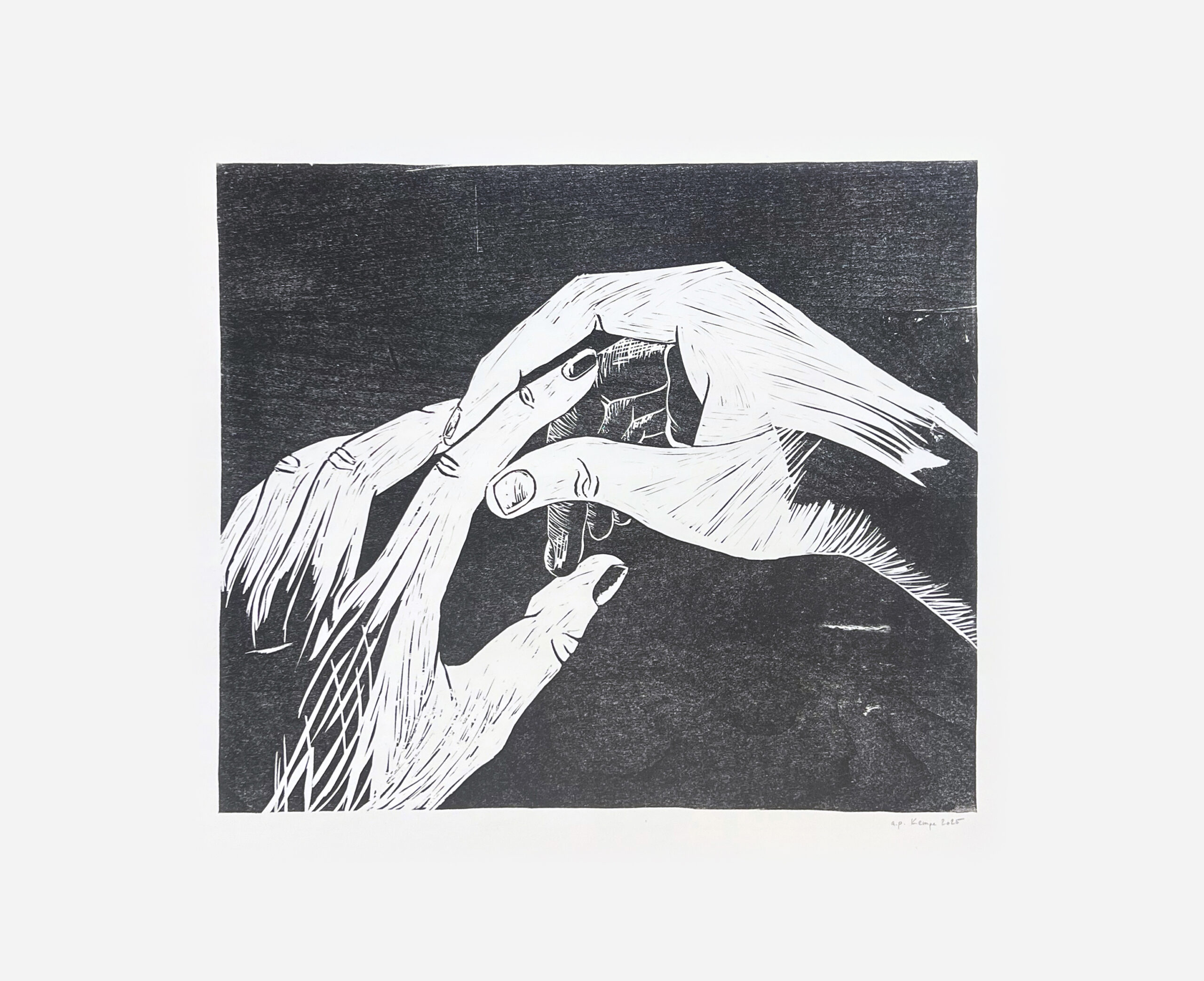
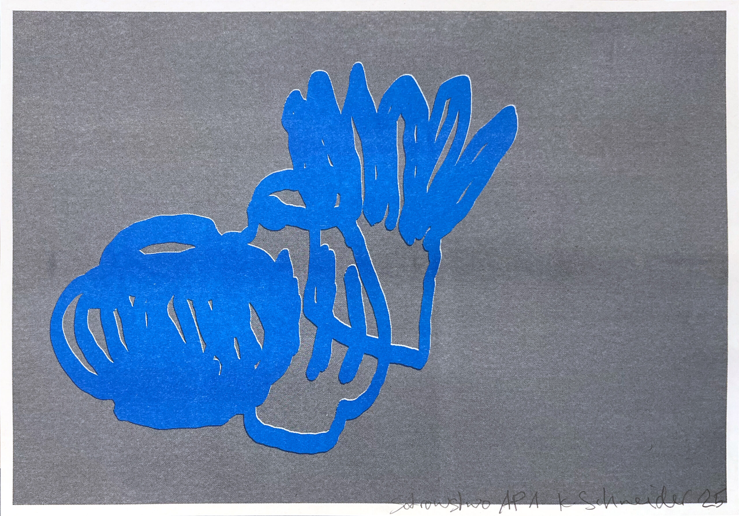
„Two hands, a touch with oneself or a counterpart. A gesture between selfassurance, establishing contact and a moment of intimacy.“
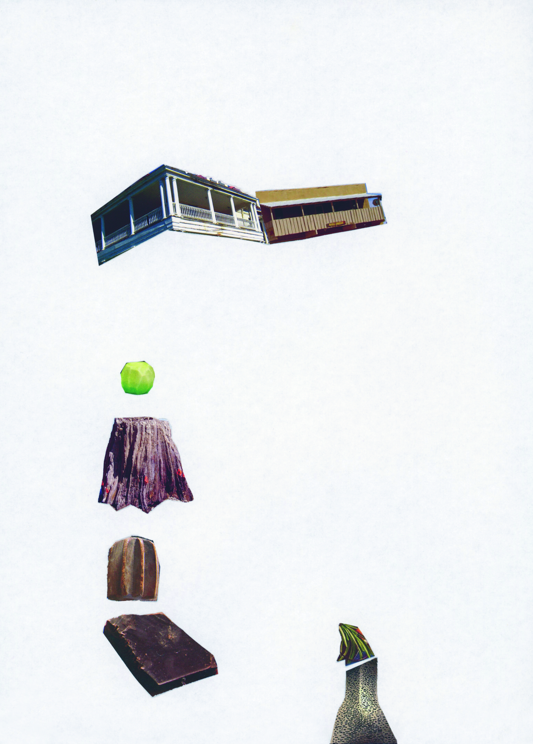
Michael Hahn spent the last year in Silver City, New Mexico, USA. The contribution to the edition was developed there:
The snippets for the collage come from tourism brochures, including edible New Mexico and Downtown Silver City Walking Tours. The balconies, which are shown as cutout forms, are located along a parade route in Silver City. Street parades often take place here – like the „Dia de los Muertos“ parade in November and the “Silver City Lighted Christmas Parade”, both of which I was able to watch from the sidewalk.
In the past, ticker tape (confetti) was often thrown in the air at such events in the USA, with New York being particularly famous for its use during parade events. Punk and hardcore concerts with American bands at Conne Island in Leipzig in the early 90s would always feature a gigantic scrap paper fight. Before these concerts, I would help to cut up newspapers and brochures for the shows.
„On the way back from the valley I have to stop at Penny. Culture and nature aren’t opposites – perhaps they’re more like layers that overlap. Sometimes one moves to the foreground, sometimes the other, sometimes both at once. And sometimes, you can’t tell at all. Then, it remains unclear.“
„The risoprint shows three forms from a Brethren tradition. Paper sleeves wrapped around candles. As protection from the hot dripping wax, but also as a symbol for palm trees. For me, they symbolise the ushers I remember from my
childhood, who carried the candles into church. sotrowstwo means sisterhood.“
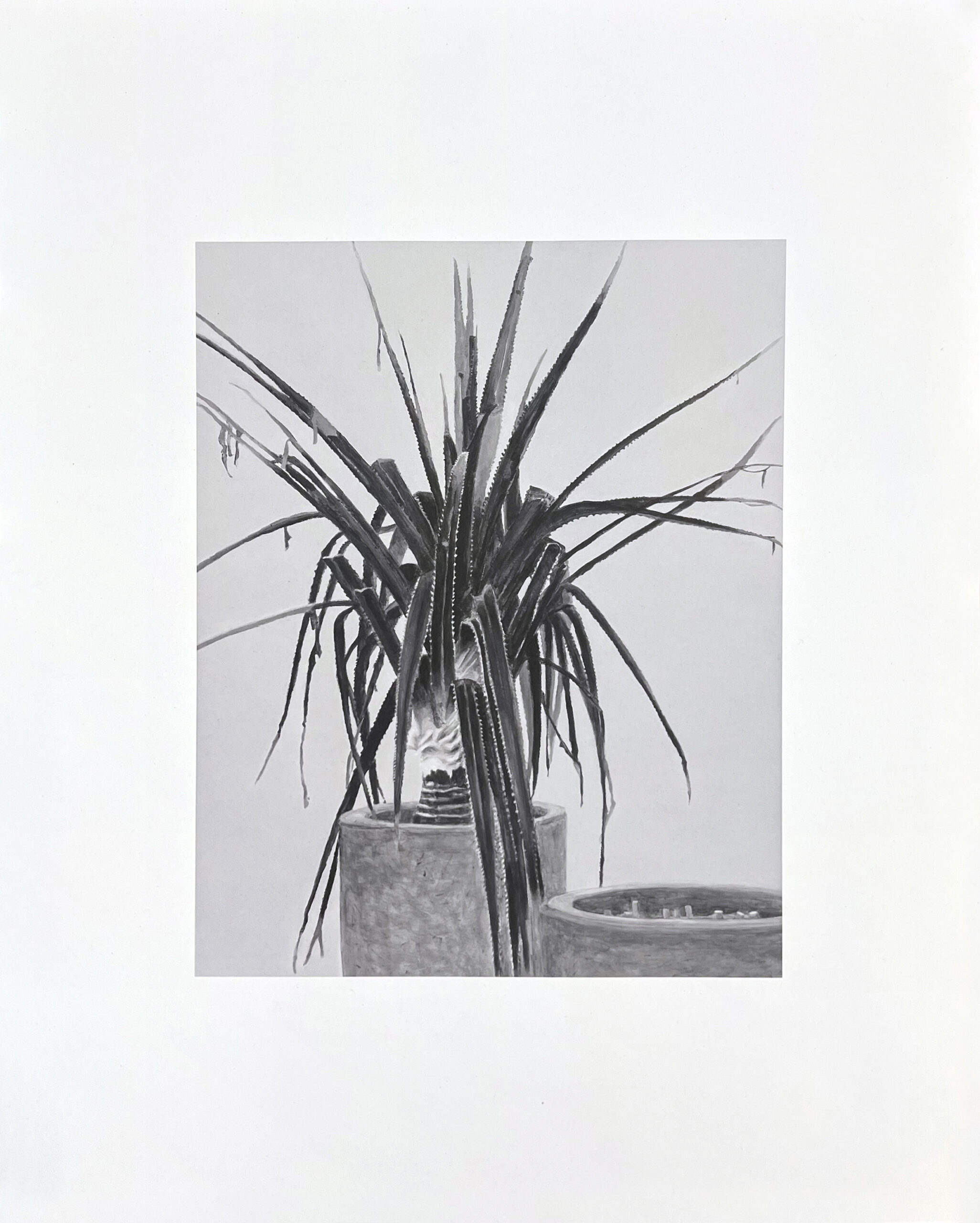
The palm tree is a pathos formula for desire; as a potted plant, photo wallpaper or promenade decoration in buckets by the wayside. It holds out the promise of a freedom which, as a domesticated useful plant in banana plantations, it does not have any more than the tourist in fenced-in hotel complexes, SUVs in wild areas – or here: in a glass box on the Smokers‘ Area on the ferry „Norröna“ between the Faroe Islands and Iceland. (from Europabad – text by Marcel
Raabe)
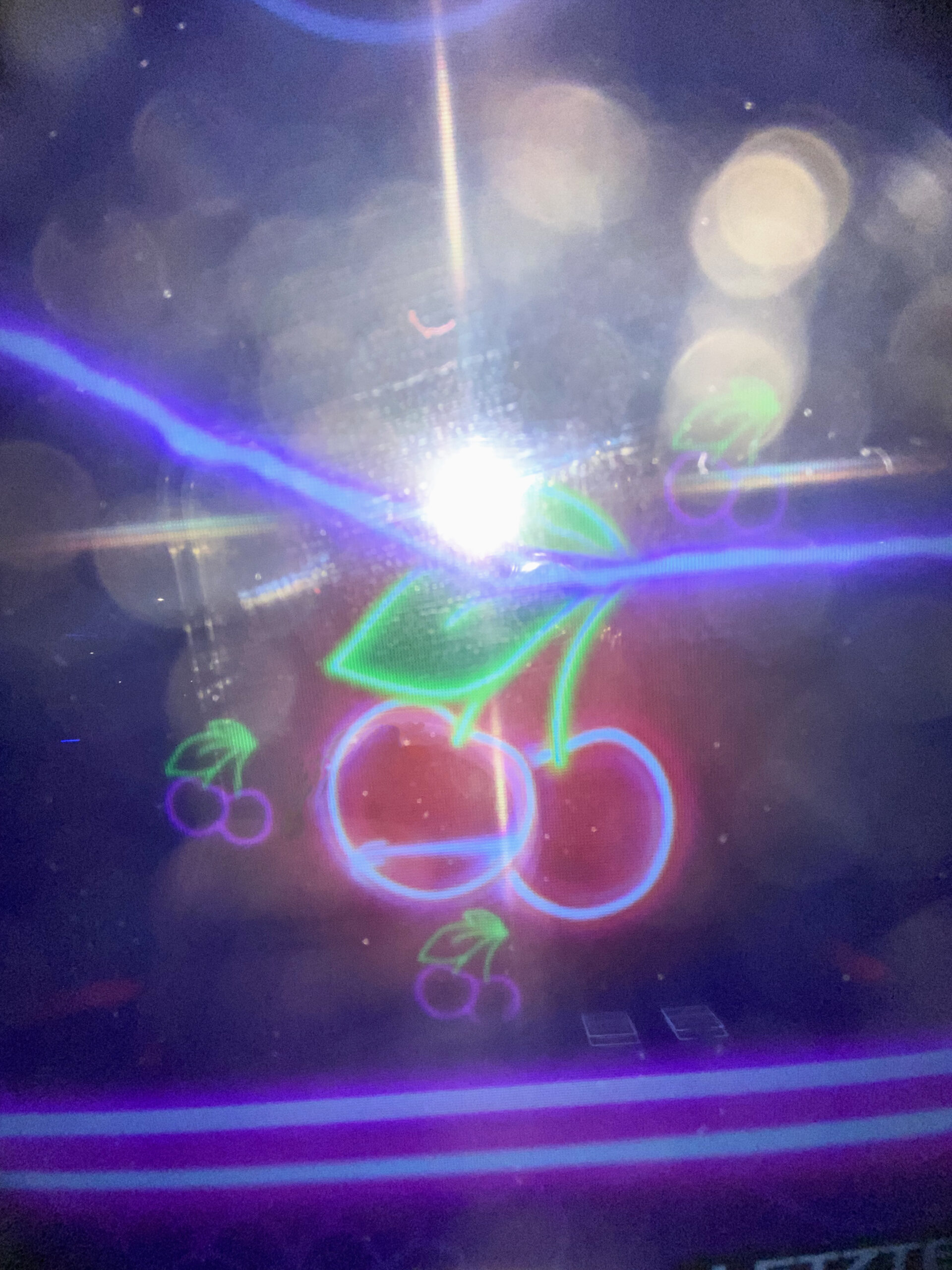
The „fruits“ series was created in connection with my research into arcades (“fairplay,” 2024) in urban areas. On the slot machines, I first tried games with the simplest principle of the winning option: A sequence of identical fruits leads to a win. It is one of the most popular games and is offered in various designversions under the names „wild fruits,“ „mega wild fruits,“ „wild, wild fruits,“ „blow wild fruits,“ and „crazy wild fruits“ on the machines or online.
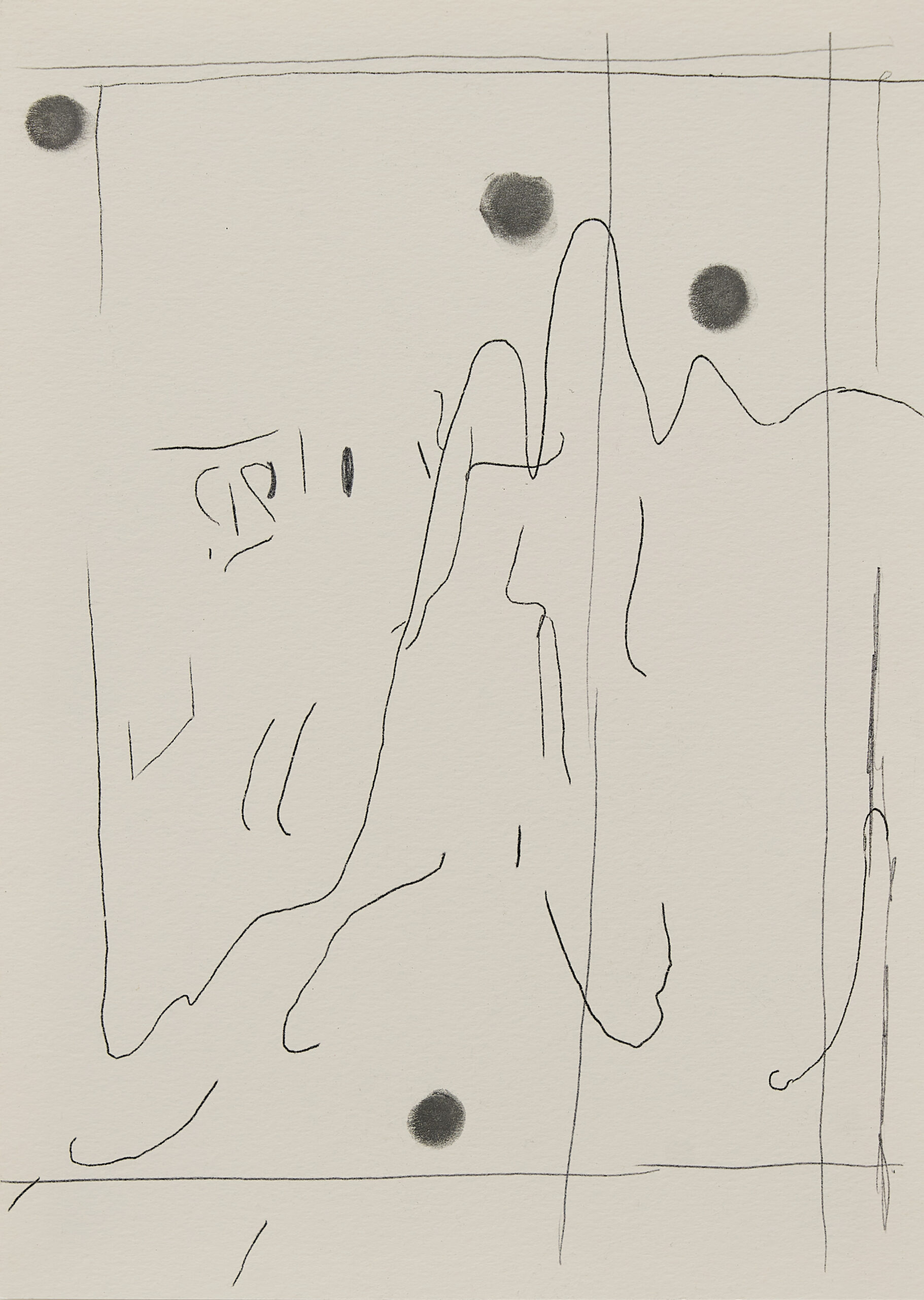
The starting point for I was here (1) is a monotype, inspired by a painting and continued in drawing. The dots are graphite powder rubbed in with finger, greasy-looking marks, varying in number and position in the pictorial space.
Repetition determines the process and nothing is ever quite the same. 25 + 2 unique pieces.
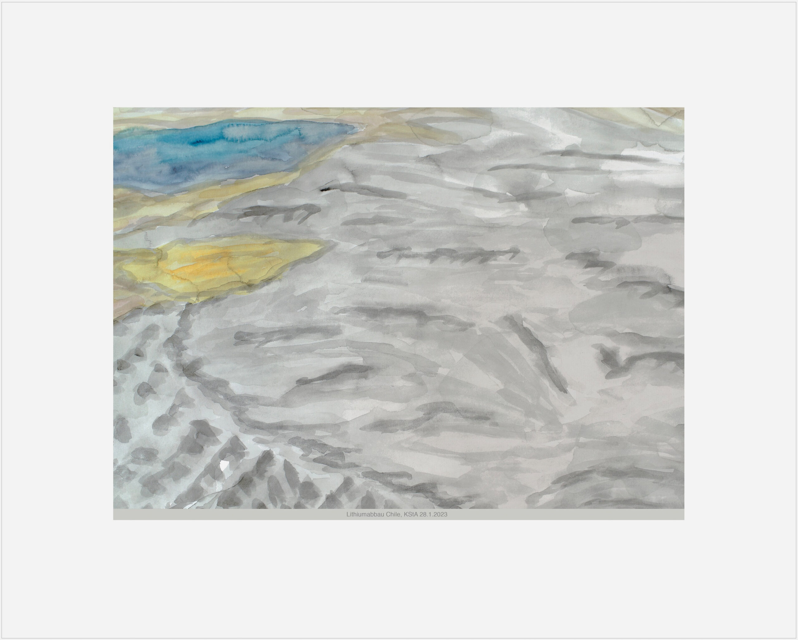
The edition ‘Lithium Mining Chile, KStA 28.1.2023’ was created based on a watercolour from the GLOBAL ECHO series. The watercolours combine an attempt to depict drought, flooding, water scarcity, ice melt and other regional and global climate and raw material disasters. The global views are based on newspaper and internet photos, and the images are accompanied by the respective source references: in this case, KSTA (Kölner Stadtanzeiger) from 28 January 2023.
In translating the current photographic models into painterly analogies, I experience an intensification of the problem and am interested in art-historical references, such as Dürer’s watercolour ‘Traumgesicht’ (1525) – a flood engulfs
the world – or Cézanne’s ‘The Railway Cutting’ — railways crossing landscapes for the first time (around 1870).
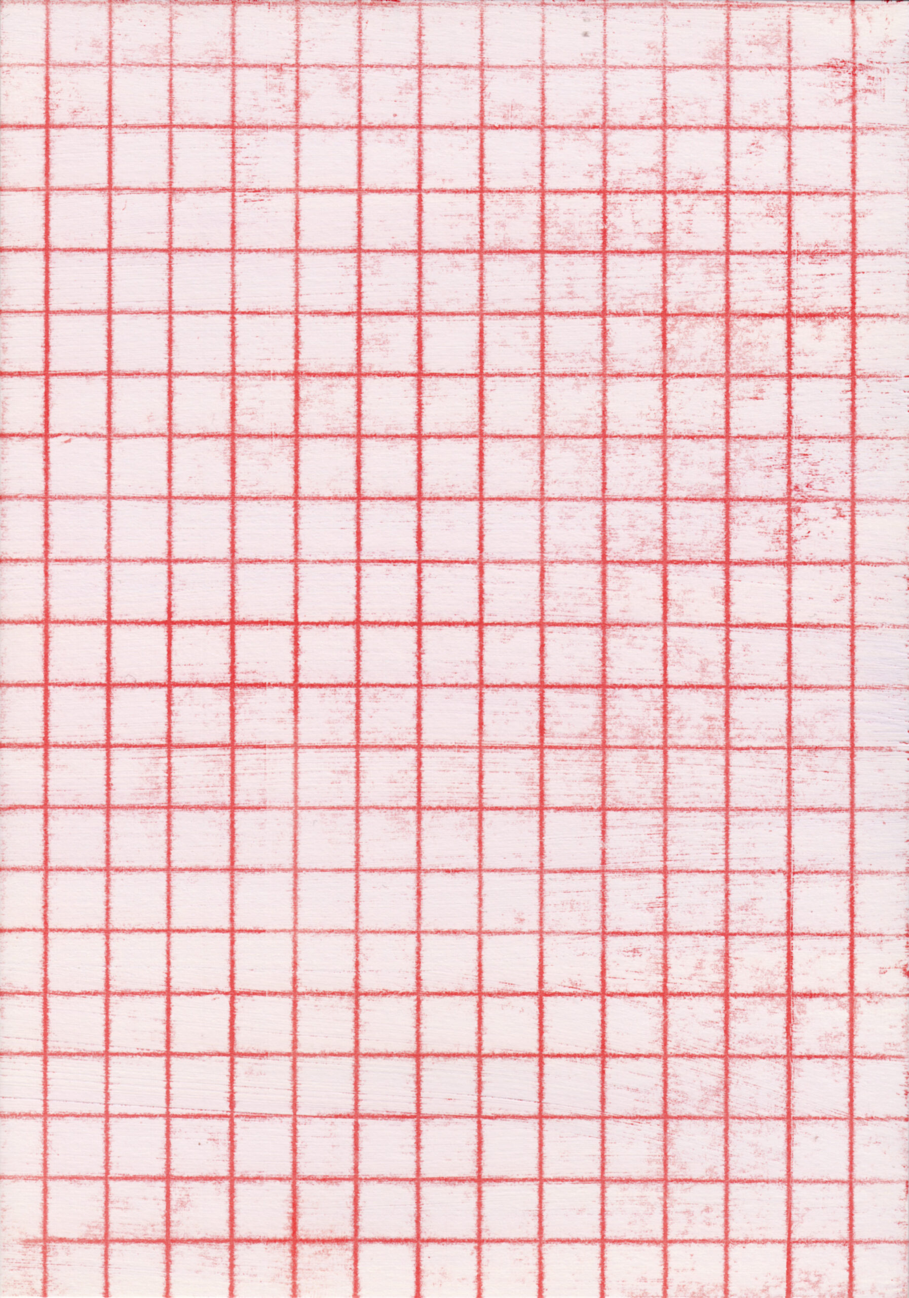
Spaces of measurement, categorisation and description are central points of reference in Heide Nord’s artistic practice. She explores the visual language of scientific representation systems – diagrams, tables, grids – and their aesthetic and poetic potential. In her work, she investigates how methods of analysis can be translated into artistic forms. For her, the grid acts as a supposed system of orientation, a fragile order between precision and dissolution, between system and gesture. Nord works here in the normed size of the DIN format. The reference to the standardised measurement systems of modernity points to rationality and comparability, which are simultaneously opened up and shifted in her work. Formal rigour meets craftsmanship – and a conscious openness to chance and process. The sheet for the edition condenses these aspects in a concentrated form.
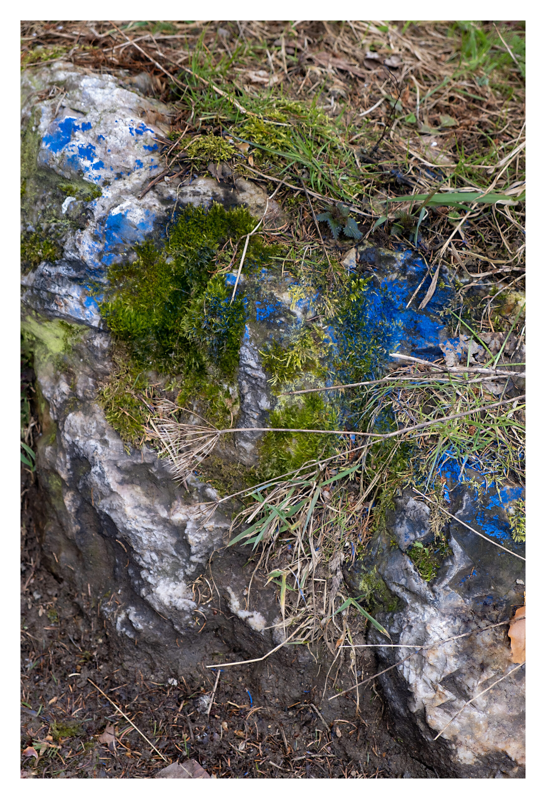
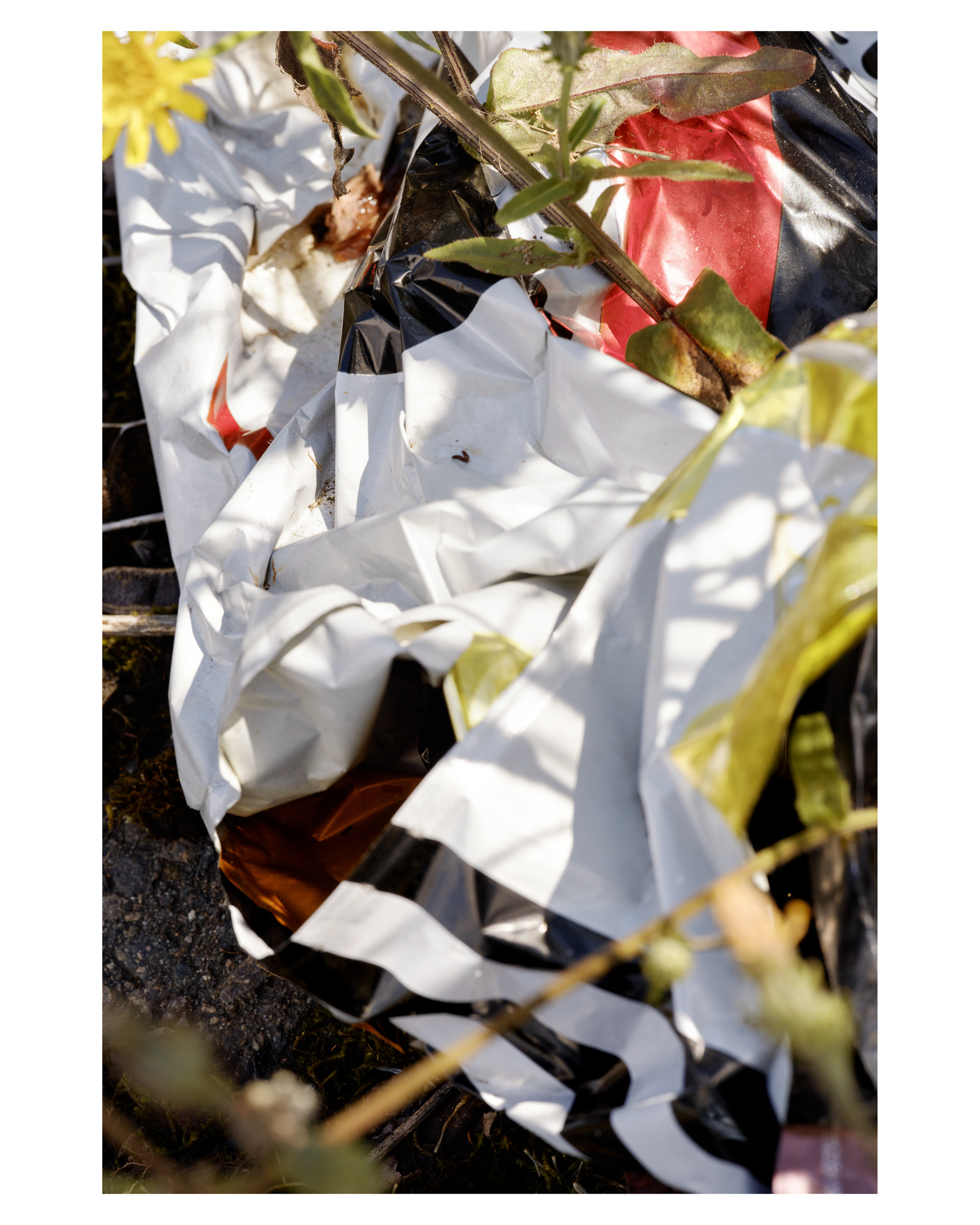
„For several years now, I have been repeatedly photographing at the old trade fair grounds in Leipzig. It was the first area I discovered after moving to Leipzig, and I continue to follow its development to this day. My close-ups reveal traces of this transformation. This detail was captured in spring 2025 at the edge of a fence on one of the vacant lots.“
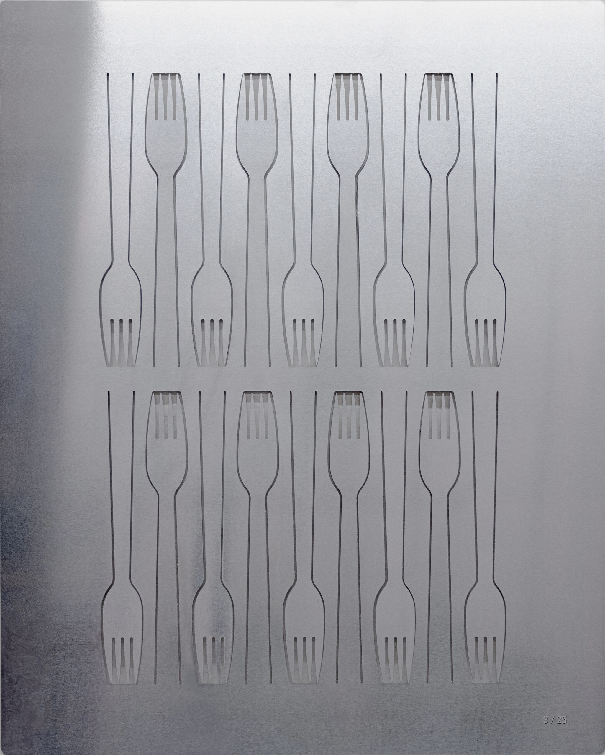
The aluminum cutlery of ALEKTO was once an inseparable part of East German everyday life — found in summer camps, motorway diners, and night train bistros. The laser-cut 4 mm aluminum plate reproduces a famous fork, based on an original unearthed from the rubble of a demolished canteen of a former state-owned enterprise near Erfurt. Eighteen forks appear in the edition, each representing one of the 18 members of Galerie b2.